
This Part 2 continues the previous tutorial—see Part 1.
In Part 1 we built an AJAX‑powered modal with Django and jQuery UI; here we focus on styling. We apply custom CSS that matches this blog’s theme and highlight selector patterns useful when adapting jQuery UI components.
Before changing CSS

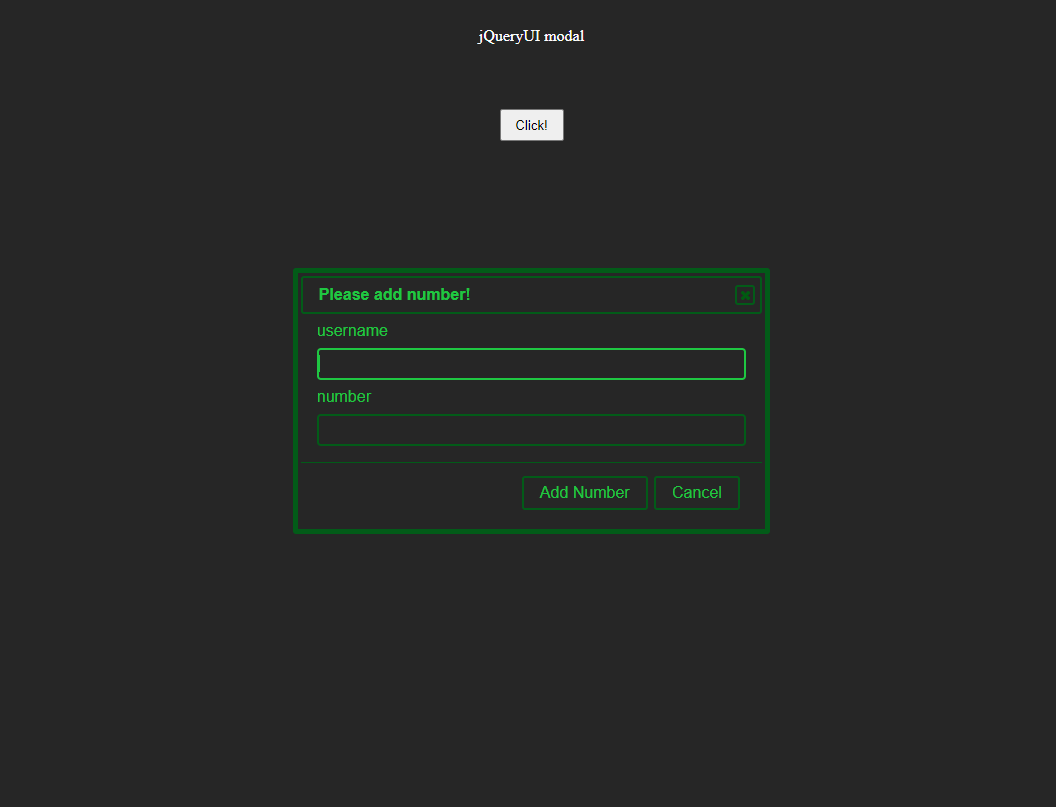
After changing CSS
The CSS is as follows:
*{
    padding:0;
    margin:0;
    box-sizing:border-box;
}

body{
    background-color: #262626;
    width: auto;
    height: 100vh;
}

.button{
    width: 100vw;
    height: auto;

    display: flex;
    flex-direction: column;
}

.button__title{
    width: auto;
    margin: 2rem;
    color: #ffffff;

    display: flex;
    justify-content: center;
    align-items: center;
}

.button__area{
    width: auto;
    margin: 2rem;

    display: flex;
    justify-content: center;
    align-items: center;
}

.button__click{
    width: 4rem;
    height: 2rem;
}

/***************************
Modal design CSS from here
****************************/

body .ui-widget.ui-widget-content{
   border: 5px solid #025B18;
}

body .ui-widget-content{
    border: 1px solid #025B18;
    background-color: #262626;
}

body .ui-widget-header{
    border: 2px solid #025B18;
    background-color: #262626;
}

.ui-dialog-title{
    color:#1FC742;
}

/***************************
Button at the bottom of the modal
****************************/

.ui-dialog-buttonset button,
.ui-dialog-buttonset button:focus {
    color:#1FC742;
    background-color: #262626;
    border: 2px solid #025B18;
}

.ui-dialog-buttonset button:hover{
    color: #262626;
    background-color: #1FC742;
    border: 2px solid #025B18;
}

/***************************
Close button in the upper right corner of the modal
****************************/

button .ui-dialog-titlebar-close{
    background-color: #262626;
    border: 2px solid #025B18;
}

.ui-button-icon.ui-icon.ui-icon-closethick {
    background-color: #262626;
}

.ui-dialog .ui-dialog-titlebar-close,
.ui-dialog .ui-dialog-titlebar-close:hover,
.ui-dialog .ui-dialog-titlebar-close:focus {
    border: 2px solid #025B18;
}

.ui-icon {
    background-image: url(http://download.jqueryui.com/themeroller/images/ui-icons_025B18_256x240.png) !important;
}

/********************
field of form, not the default component of jqueryUI.
*********************/

.click__confirm{
    display:grid;
    grid-template-columns:1fr;
    grid-template-rows:auto;
    grid-gap:0.5rem;
}

.form_field{
    background: #262626;
    color:#1FC742;
    height:2rem;
    border: 1px solid #025B18;
    border-radius: 4px;
}

.form_field:focus{
    color:#1FC742;
    height:2rem;
    border: 2px solid #1FC742;
    border-radius: 4px;
    outline: none
}

.click__label{
   color:#1FC742;
}

.success_message{
    color:#1FC742;
}

/********************
Remove arrows from input fields of the type where numbers are entered
*********************/

input[type="number"]::-webkit-inner-spin-button {
  -webkit-appearance: none;
}
Reflections after completing these CSS modifications:
- Replacing the “×” close icon color took some trial and error, but jQuery UI lets you adjust icon appearance via its CSS classes. Please see this Stack Overflow page.
- While not directly related to jQuery UI, the browser's default number input fields display increment/decrement arrows. I find these arrows visually cluttered, so I removed them using the following code:
input[type="number"]::-webkit-inner-spin-button {
  -webkit-appearance: none;
}
The jQueryUI documentation provides guidance on changing CSS. To understand which classes are available in jQueryUI, it's helpful to look at this page first.
I have placed this repository in this branch of the same repository as the previous article. For your reference, happy coding!