
Making sidebar navigation with only the use of CSS grid layout in the template of Django
Why Build from Scratch?
Sidebar navigation is a staple of modern web design, but implementing it properly—especially with responsive behavior and swipe gestures—is surprisingly difficult.
While popular frameworks like Bootstrap and Tailwind CSS offer sidebar components, they often come with trade-offs:
- Limited Functionality: Many lack built-in swipe support for mobile devices.
- Code Bloat: Frameworks like Tailwind can clutter HTML with numerous classes, making maintenance difficult.
- Rigidity: Customizing pre-built components often breaks their internal logic, making them harder to modify than building from scratch.
Through trial and error, I found that the most efficient way to create a flexible, swipe-enabled sidebar is to build it from the ground up using CSS Grid and JS. In this article, I'll show you how to implement a robust sidebar navigation system without relying on heavy CSS frameworks.
Visualizing the Django Application
Below are the designs for PC, mobile, and tablet devices, respectively.
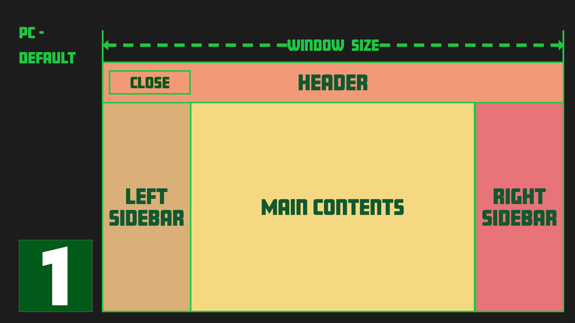
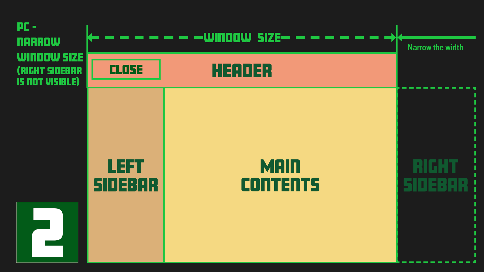
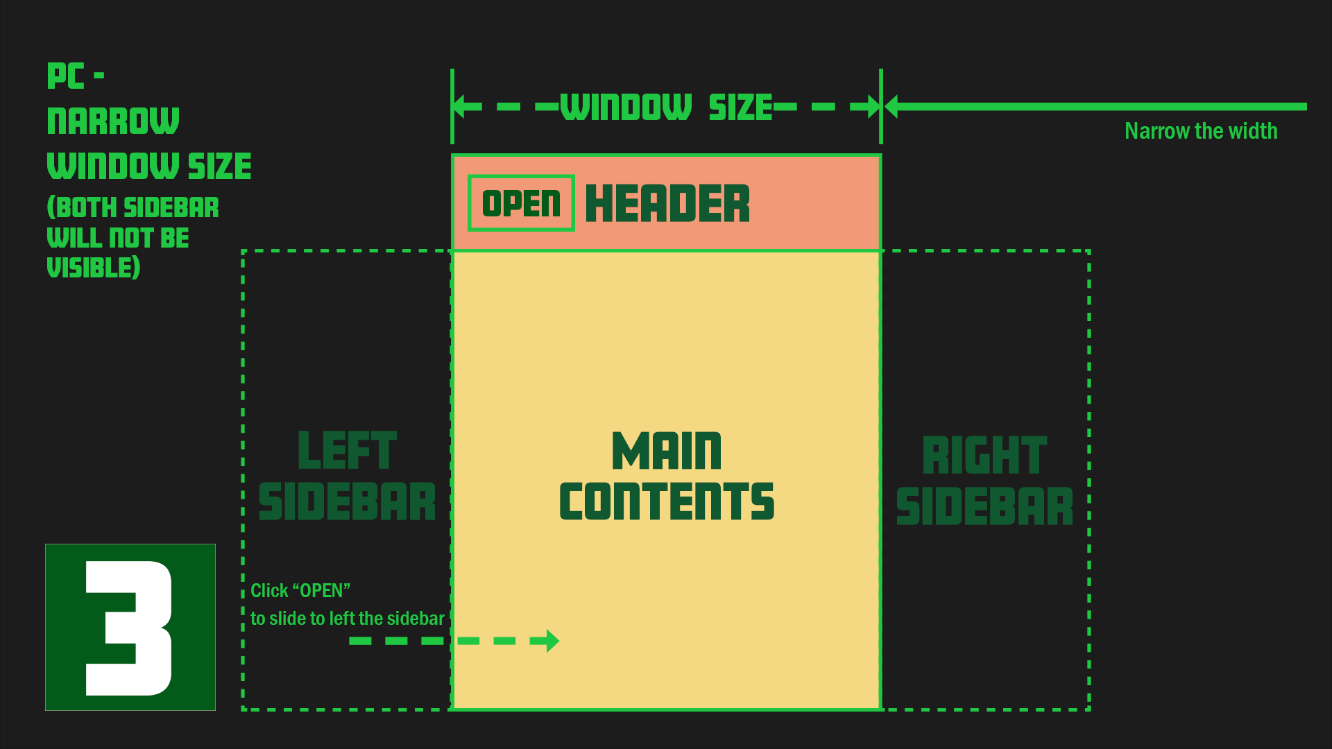
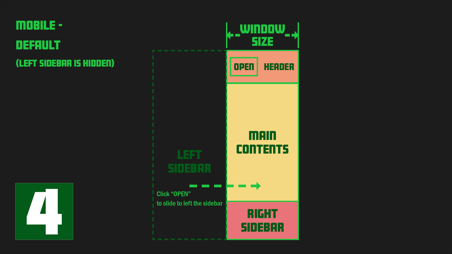
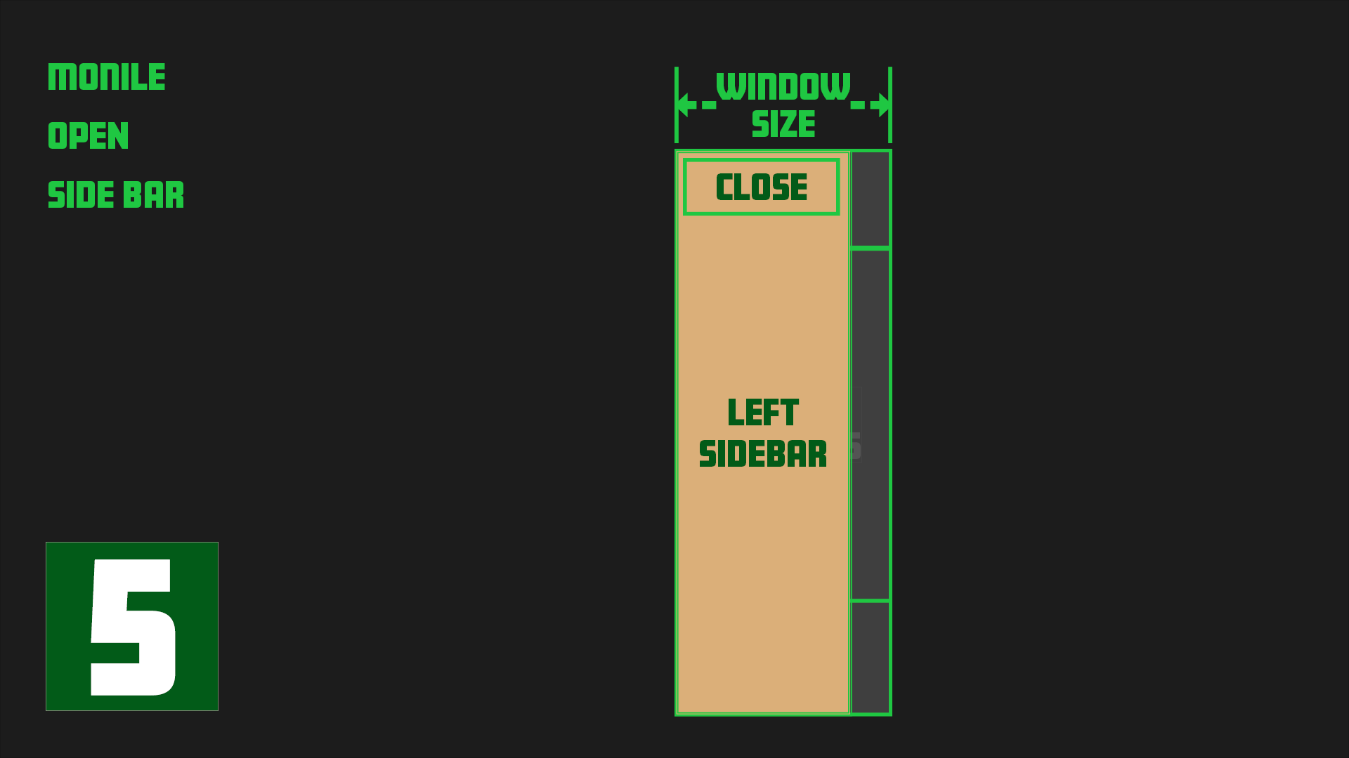
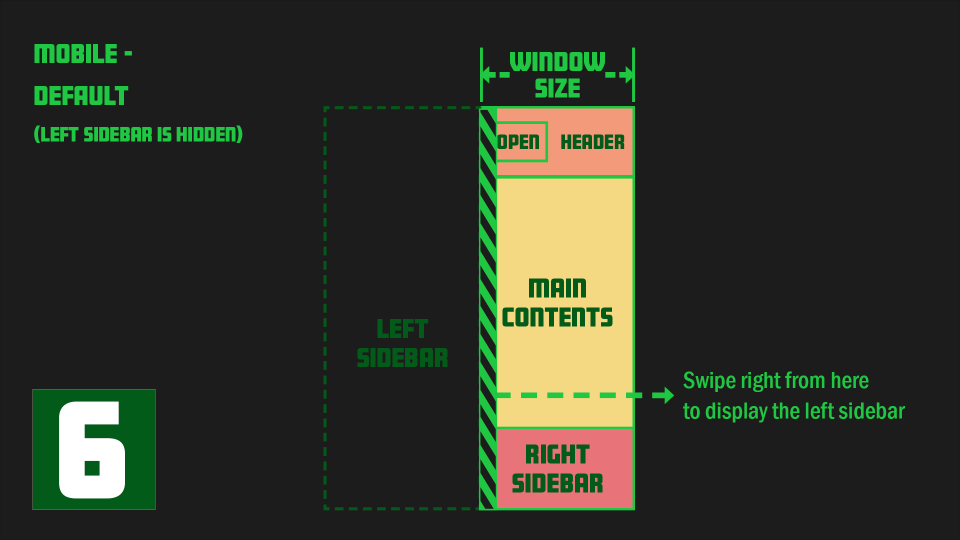
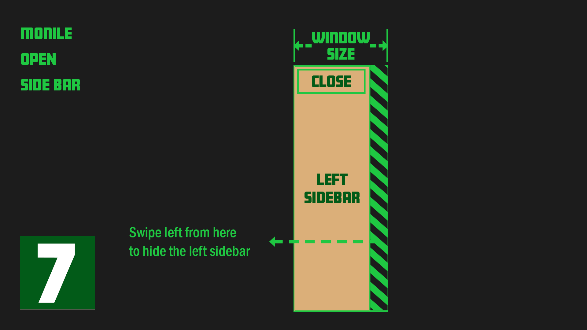
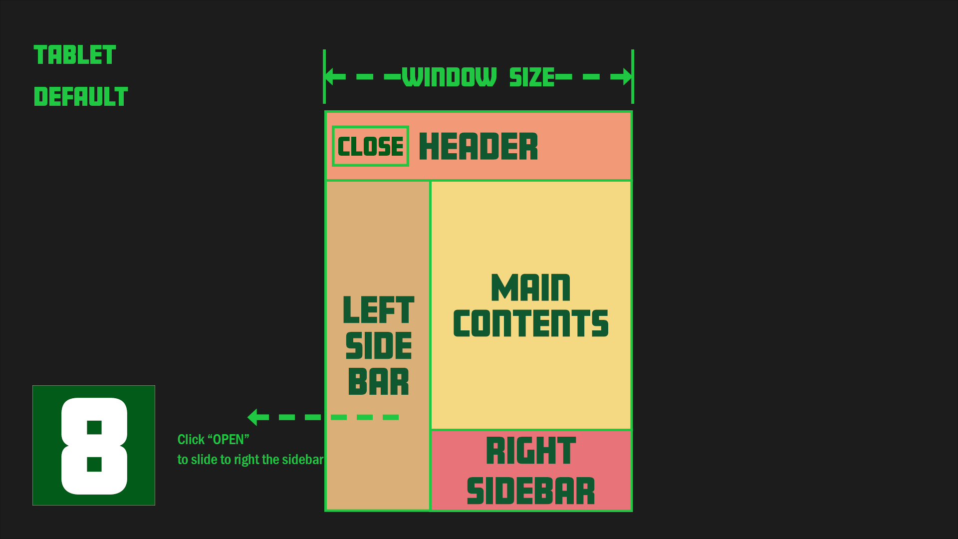
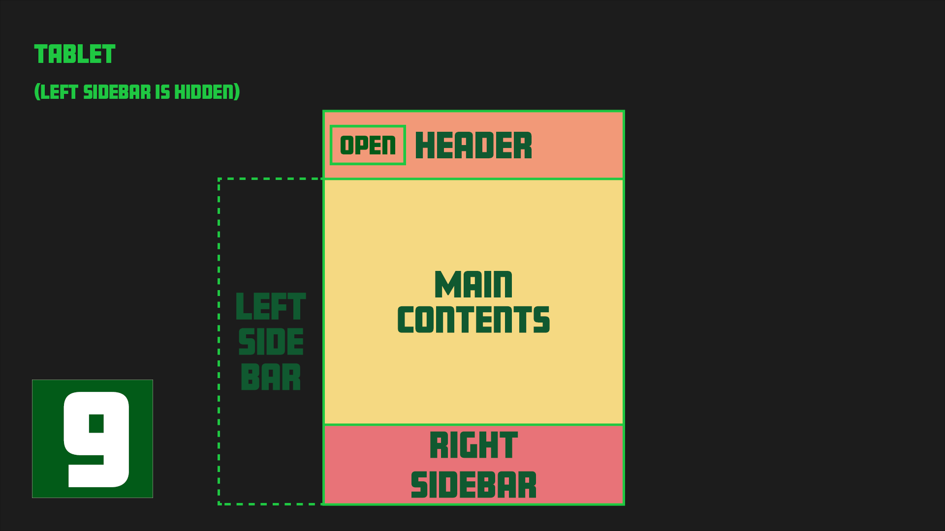
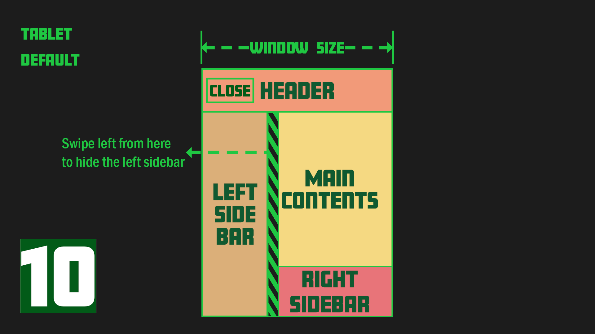
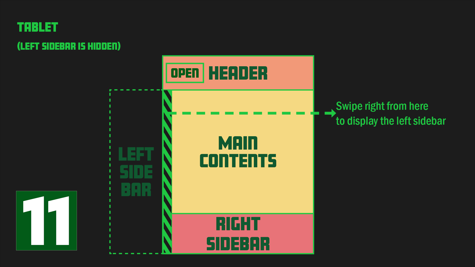
Images 1-3 depict PC designs, images 4-7 show mobile designs, and images 8-11 represent tablet designs.
For both PC and tablet designs, the sidebar is initially open. However, in the case of mobile designs, the sidebar is closed by default.
Each design starts in a specific state: image 1 for PC, image 4 for mobile, and image 8 for tablet.
Required Python Packages
The following packages will be used to implement this sidebar navigation:
- - django==4.05
- - django-environ==0.8.1
- - django-user-agents==0.4.0
django-user-agents is an important package in the list above. It enables us to separate files and code to be loaded for each device.
JS library
The JS libraries used for this project are Alpine.js and jQuery.
I like Alpine.js because it is considered an alternative to jQuery and can achieve various operations with minimal code added inside HTML tags.
I initially considered using Vanilla JS instead of jQuery, but I realized in Chapter 10 that implementation would be difficult without jQuery, so I decided to use jQuery in addition to Alpine.js. Also, there is a chapter at the end of this tutorial that implements swipe functionality on mobile devices, where we will use a library called Hammer.js.
Project File Structure
The initial file structure of this project is as follows.
django_03/
├── blog/
│   ├── __init__.py
│   ├── admin.py
│   ├── apps.py
│   ├── migrations/
│   │   └── __init__.py
│   ├── models.py
│   ├── tests.py
│   └── views.py
├── django_03/
│   ├── __init__.py
│   ├── asgi.py
│   ├── settings.py
│   ├── urls.py
│   └── wsgi.py
└── manage.py
For this project, we only need to write the TEMPLATE part, so the models.py and other default files are sufficient and need no modifications.
The project name is django_03 and the app name is blog.
The image below shows the file structure after adding the static and template files.
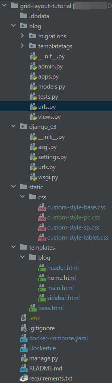
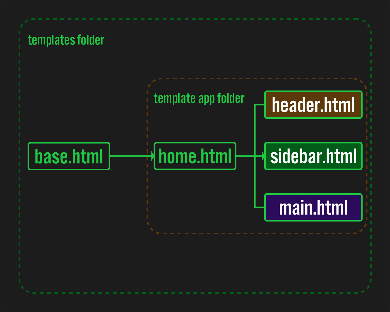
As you'll see later in the code, the structure of the template file is as follows:
The files header.html, sidebar.html, and main.html are grouped together in home.html using the include tag.
The purpose of this is to intentionally separate the header and sidebar into distinct files, which clarifies the role of each file, improves readability, and facilitates customization.
Development Process
Create this website in the following steps.
- Basic Django setup
- Creating
settings.py - Writing the Code Foundation, including
base.html - Foundational CSS Code for Building Grid Layouts
- Implementation of OPEN/CLOSE button
- Separating the HTML and CSS code to load by the User-Agent
- Adding CSS Based on Device
- Open/Close the Sidebar Menu Automatically on PC at a Certain Width
- Swipe to Open/Close
- When a Link in the sidebar is clicked, the sidebar should close before going to the next page
1. Basic Django setup
To proceed with this tutorial, you will need a basic Django setup. However, as there are many articles and videos available online, we will not go into detail here.
If you prefer to use Docker for the setup, you can find instructions in this article on our blog.
Once you have the setup ready, please proceed to display "Hello world!" in your own browser.
2. Creating settings.py
To use django-user-agents, specific settings need to be added to settings.py. Please modify settings.py as follows:
In this project, django_user_agents is important. Please ensure that it is included in the INSTALLED_APPS and MIDDLEWARE settings, as shown below.
django_03/settings.py
from pathlib import Path
import environ
import os


env = environ.Env()

BASE_DIR = Path(__file__).resolve().parent.parent

environ.Env.read_env(os.path.join(BASE_DIR, '.env'))

SECRET_KEY = os.getenv('SECRET_KEY')

DEBUG = os.getenv('DEBUG_VALUE') == 'TRUE'

ALLOWED_HOSTS = []


# Application definition

INSTALLED_APPS = [
    'django.contrib.admin',
    'django.contrib.auth',
    'django.contrib.contenttypes',
    'django.contrib.sessions',
    'django.contrib.messages',
    'django.contrib.staticfiles',
    'django_user_agents', # here
    'blog'
]

MIDDLEWARE = [
    'django.middleware.security.SecurityMiddleware',
    'django.contrib.sessions.middleware.SessionMiddleware',
    'django.middleware.common.CommonMiddleware',
    'django.middleware.csrf.CsrfViewMiddleware',
    'django.contrib.auth.middleware.AuthenticationMiddleware',
    'django.contrib.messages.middleware.MessageMiddleware',
    'django.middleware.clickjacking.XFrameOptionsMiddleware',
    'django_user_agents.middleware.UserAgentMiddleware', # here
]

ROOT_URLCONF = 'django_03.urls'

TEMPLATES = [
    {
        'BACKEND': 'django.template.backends.django.DjangoTemplates',
        'DIRS': [BASE_DIR / 'templates'],
        'APP_DIRS': True,
        'OPTIONS': {
            'context_processors': [
                'django.template.context_processors.debug',
                'django.template.context_processors.request',
                'django.contrib.auth.context_processors.auth',
                'django.contrib.messages.context_processors.messages',
            ],
        },
    },
]

WSGI_APPLICATION = 'django_03.wsgi.application'


# Database
# https://docs.djangoproject.com/en/4.0/ref/settings/#databases

DATABASES = {
    'default': {
        'ENGINE': 'django.db.backends.postgresql_psycopg2',
        'NAME': os.getenv('DB_NAME'),
        'USER': os.getenv('DB_USER'),
        'PASSWORD': os.getenv('DB_PASSWORD'),
        'HOST': os.getenv('DB_HOST'),
        'PORT': os.getenv('DB_PORT'),
    }
}


# Password validation
# https://docs.djangoproject.com/en/4.0/ref/settings/#auth-password-validators

AUTH_PASSWORD_VALIDATORS = [
    {
        'NAME': 'django.contrib.auth.password_validation.UserAttributeSimilarityValidator',
    },
    {
        'NAME': 'django.contrib.auth.password_validation.MinimumLengthValidator',
    },
    {
        'NAME': 'django.contrib.auth.password_validation.CommonPasswordValidator',
    },
    {
        'NAME': 'django.contrib.auth.password_validation.NumericPasswordValidator',
    },
]


# Internationalization
# https://docs.djangoproject.com/en/4.0/topics/i18n/

LANGUAGE_CODE = 'en-us'

TIME_ZONE = 'UTC'

USE_I18N = True

USE_TZ = True


STATIC_URL = 'static/'

STATICFILES_DIRS = [
    os.path.join(BASE_DIR, "static"),
]

STATIC_ROOT = os.path.join(BASE_DIR, 'staticfiles')


DEFAULT_AUTO_FIELD = 'django.db.models.BigAutoField'
3. Writing the Code Foundation, including base.html
We will begin by writing the most basic part of the template: base.html. Note that we will be adding Alpine.js to base.html.
Next, we will add the essential parts of home.html, header.html, main.html, and sidebar.html, following the above template file structure.
templates/blog/base.html
{% load static %}
<html lang="en" data-theme="dark">
<head>
    <meta charset="UTF-8">
    <meta name="viewport" content="width=device-width, user-scalable=no, initial-scale=1.0, maximum-scale=1.0, minimum-scale=1.0">
    <meta http-equiv="X-UA-Compatible" content="ie=edge">

    <!-- alipine.js and jquery  -->
    <script defer src="https://unpkg.com/[email protected]/dist/cdn.min.js"></script>
    <script src="https://code.jquery.com/jquery-3.6.0.min.js"></script>
    <!-- css  -->
    <link rel="stylesheet" href="{% static 'css/custom-style-base.css' %}">

    <title>{% block title %}Grid Layout{% endblock %}</title>
</head>

<body>
    <section class="grid">
        {% block content %}{% endblock %}
    </section>
</body>
</html>
templates/blog/home.html
{% extends 'base.html' %}

{% block content %}

        {% include "blog/header.html" %}

        {% include "blog/sidebar.html" %}

        {% include "blog/main.html" %}

{% endblock %}
templates/blog/header.html
<header class="header"></header>
templates/blog/sidebar.html
<section id="sidenav" class="sidenav">
    <div class="sidenav__contents"></div>
</section>
templates/blog/main.html
<main id="main" class="main">
    <section class="main__text"></section>
</main>
4. Foundational CSS Code for Building Grid Layouts
After writing the basic HTML template, write the corresponding foundational CSS code. First, create a static folder in the root of the project. Then, create a css folder inside the static folder, and finally create custom-style-base.css.
In this CSS code, the :root part centrally manages the colors used in this site, such as text colors.
Feel free to change the :root section to your liking, as it reflects my personal taste.
static/css/custom-style-base.css
*{
    padding:0;
    margin:0;
    box-sizing:border-box;
}

html{
    font-size: 62.5%;
}

:root{
    --main-font-family:'Roboto Condensed', sans-serif;
    --main-background-color:#F5D982;
    --header-background-color:#F29A79;
    --sidebar-background-color:#DBAF79;
    --reference-background-color:#E87479;
    --header-border-color:#5C564E
}

body{
    font-family: var(--main-font-family);
    position: absolute;
    top: 0;
    bottom: 0;
}
5. Implementation of OPEN / CLOSE button
Next, create a function that opens and closes the sidebar by clicking the button. This is where Alpine.js finally comes into play.
Let's start with the PC version.
As you may know, CSS can combine selectors to refer to different properties and values than those referenced by a single selector.
For example, if you have two styles, .main{width:50%} and .main.open{width:100%}, <div class="main"> will have width:50%, but <div class="main open"> will have width:100%.
Therefore, in this example, if .open can be added dynamically, it is possible to achieve conditional branching-like functionality in CSS.
We will use this to create the open/close function of the button.
templates/blog/base.html
...
<body>
    <section class="grid"
             x-data="{
                open:true,
                close:true,
                header_text:true,
                }"
             @toggle.window="
                open = !open;
                close = !close;
            "
        >
        ...
    </section>
</body>
...
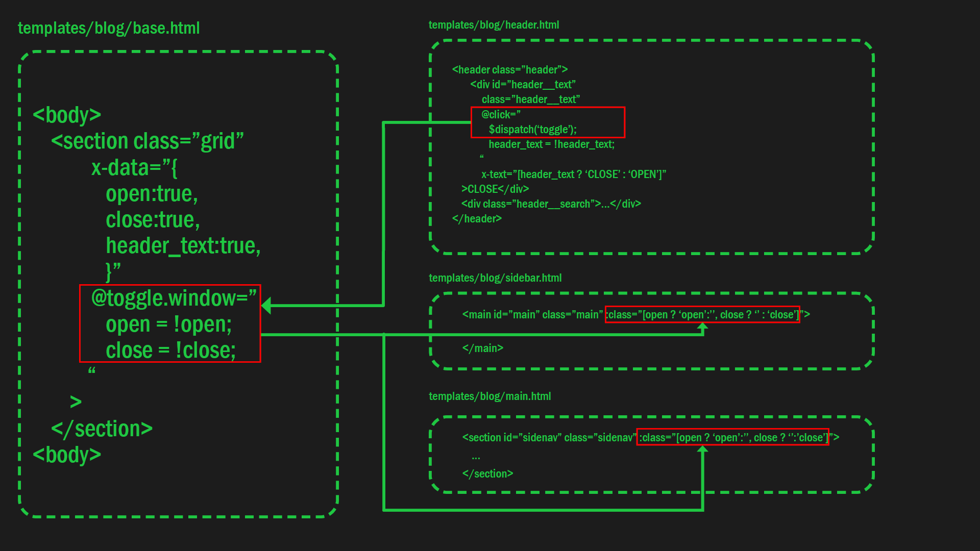
To implement the desired behavior, make the following changes to header.html, sidebar.html, and main.html.
In header.html, there is a @click event that toggles the open and close values of @toggle.window in base.html. Please pay attention to this event.
When the open value in @toggle.window is switched, it affects the :class attribute in both sidebar.html and main.html. Specifically, when the true or false value of open on the left side of ? is toggled, the value on the right side of ? (open or '') is added as a class accordingly.
templates/blog/header.html
<header class="header" :class="[open ? 'open':'']">
        <div id="header__text"
             class="header__text"
             @click="
                $dispatch('toggle');
                header_text = !header_text;
            "
             x-text="[header_text ? 'CLOSE' : 'OPEN']"
    >CLOSE</div>
    <div class="header__search">...</div>
</header>
templates/blog/sidebar.html
<section id="sidenav" class="sidenav" :class="[open ? 'open':'', close ? '':'close']">
    ...
</section>
templates/blog/main.html
<main id="main" class="main" :class="[open ? 'open':'', close ? '' : 'close']">
    ...
</main>
The diagram below summarizes the relationship between the code in each of the files above.
The open/close function implementation with buttons for the PC version is now complete. However, it will not work as is on mobile and tablet, since the initial sidebar position is different. To solve this, the code to be loaded for each device is determined by the User-Agent.
6. Separating the HTML and CSS code to load by the User-Agent
As we mentioned earlier, this application has a slightly different design for each device, which makes it difficult to control the design with a single template. To solve this issue, apply different CSS and templates for each device depending on the User-Agent.
To detect the User-Agent, use a package called django-user-agents. You can see how to use django-user-agents in the official documentation, so we won't describe it here. One thing to note is that the official django-user-agents documentation recommends using a cache. However, using a cache can often result in difficult-to-handle errors, and it works fine without a cache. That's why I currently don't use one.
7. Loading a Different CSS File for Each Device
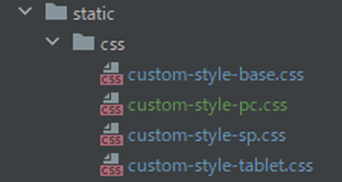
To load different CSS files for each device, add the following code to the head of `base.html` and place device-specific CSS files in the `static` folder at the root of the project.
First, create the following files in the `static/css` folder. If `custom-style-base.css` already exists in the folder, create the other two files listed below:
custom-style-pc.csscustom-style-sp.csscustom-style-tablet.css
Next, add code to base.html to isolate the template to be loaded.
templates/blog/base.html
{% load static %}
<html lang="en" data-theme="dark">
<head>
        ...

        <link rel="stylesheet" href="{% static 'css/custom-style-base.css' %}">

    {% if request.user_agent.is_pc %}
        <link rel="stylesheet" href="{% static 'css/custom-style-pc.css' %}">
    {% endif %}

    {% if request.user_agent.is_mobile and 'iPad' not in request.user_agent.device %}
        <link rel="stylesheet" href="{% static 'css/custom-style-sp.css' %}">
    {% endif %}

    {% if request.user_agent.is_tablet %}
        <link rel="stylesheet" href="{% static 'css/custom-style-tablet.css' %}">
    {% endif %}

    ...

    <title>{% block title %}Grid Layout{% endblock %}</title>
</head>

<body>
...
</body>
</html>
Next, add the code in the <body> tag to load for each device.
Similar to CSS file loading, the code for HTML must also be separated for each device.
!!Replace all code in the body tag with the following code.!!
templates/blog/base.html
...
<head>
    ...
</head>

<body>
    {% if request.user_agent.is_mobile and 'iPad' not in request.user_agent.device %}
      <section class="grid"
                 x-data="{
                    open:false,
                    close:true,
                    header_text:false,
                }"
                 @toggle.window="
                    open = !open;
                    close = !close
                "
            >
    {% endif %}
    {% if request.user_agent.is_pc %}
        <section class="grid"
                 x-data="{
                    open:true,
                    close:true,
                    header_text:true
                    }"
                 @toggle.window="
                    open = !open;
                    close = !close;
                    "
            >
    {% endif %}
    {% if request.user_agent.is_tablet %}
    <section class="grid"
         x-data="{
            open:true,
            close:false,
            header_text:false
        }"
         @toggle.window="
            open = !open;
            close = !close
        "
    >
    {% endif %}
        {% block content %}{% endblock %}
    </section>
</body>
</html>
...
Add the following code to header.html, sidebar.html, and main.html as well.
templates/blog/header.html
<header class="header" :class="[open ? 'open':'']">
    {% if request.user_agent.is_pc %}
        <div class="header__button">
            <div id="header__text__pc"
                 class="header__text"
                 @click="
                    $dispatch('toggle');
                    header_text = !header_text;
                "
                 x-text="[header_text ? 'CLOSE' : 'OPEN']"
            >CLOSE</div>
        </div>
    {% endif %}
    {% if request.user_agent.is_mobile and 'iPad' not in request.user_agent.device %}
        <div class="header__button">
           <div id="header__text__sp"
            class="header__text"
            @click="
                $dispatch('toggle');
                header_text = !header_text;
            "
            >OPEN</div>
        </div>
    {% endif %}
    {% if request.user_agent.is_tablet %}
        <div class="header__button">
            <div id="header__text__tablet"
                 class="header__text"
                 @click="
                    $dispatch('toggle');
                    header_text = !header_text;
                "
                 x-text="[header_text ? 'OPEN':'CLOSE']"
            >CLOSE</div>
        </div>
    {% endif %}
    <div class="header__search">HEADER</div>
</header>
templates/blog/sidebar.html
{% if request.user_agent.is_pc %}
    <section id="sidenav" class="sidenav" :class="[open ? 'open':'', close ? '':'close']">
{% endif %}

{% if request.user_agent.is_mobile and 'iPad' not in request.user_agent.device %}
    <section id="sidenav" class="sidenav" :class="[open ? 'open':'']">
            <div
                class="sidenav__button"
                @click="
                $dispatch('toggle');
                header_text = !header_text;
            "
            >CLOSE</div>
{% endif %}

{% if request.user_agent.is_tablet %}
    <section id="sidenav" class="sidenav" :class="[close ? 'close':'']" >
{% endif %}

        <div class="sidenav__contents">
            <div class="sidenav__title"><a class="sidebar__link" href="{% url 'blog:post_list' %}">SIDE BAR</a></div>
            <div class="sidenav__menu">
                <ul class="sidenav__items">
                        <li class="sidenav__item">item</li>
                </ul>
            </div>
        </div>

            </section>
templates/blog/main.html
{% if request.user_agent.is_pc %}
    <main id="main" class="main" :class="[open ? 'open':'', close ? '' : 'close']">
{% endif %}
{% if request.user_agent.is_mobile and 'iPad' not in request.user_agent.device %}
    <main id="main" class="main" :class="[open ? 'open' : '']">
{% endif %}
{% if request.user_agent.is_tablet %}
    <main id="main" class="main" :class="[close ? 'close' : '']">
{% endif %}

        <section class="main__text">
            <div class="main__title">MAIN</div>
            <div class="main__content">{% lorem 30 p %}</div>
        </section>

        <section class="main__reference">
            <div class="main__reference__contents">
               <div class="main__reference__title">Reference</div>
                <div class="main__reference__content">{% lorem %}</div>
            </div>
        </section>

    </main>
8. Adding CSS Based on Device
Now let's write CSS for the PC, SP, and tablet versions, which will be contained in custom-style-pc.css, custom-style-sp.css, and custom-style-tablet.css, respectively.
In custom-style-sp.css, I included code for viewing the smartphone in landscape mode at the end of the file.
static/css/custom-style-pc.css
.grid{
    position: relative;
    width: 100vw;
    height: 100%;
    min-height: 100vh;
    overflow: auto;

    display: grid;
    grid-template-columns: 30rem 1fr;
    grid-template-rows:  8rem 1fr;
    grid-template-areas:
      'header header'
      'sidenav main'
}

/**************
header
***************/

.header {
    grid-area: header;
    position: sticky;
    top: 0;
    width: 100%;
    height: 8rem;
    font-size: 3rem;
    background-color:var(--header-background-color);
    z-index: 50;

    display: grid;
    grid-template-columns: 30rem 1fr 20vw;
    justify-content: center;
    align-items: center;
}

.header__text{
    width: auto;
    height: auto;
    border: var(--header-border-color) 2px solid;

    display: flex;
    justify-content: center;
    align-items: center;
    margin: 0 0 0 1rem;
}

.header__search{
    display: flex;
    justify-content: center;
    align-items: center;
}


/**************
sidebar
***************/

.sidenav{
    grid-area: sidenav;
    position: fixed;
    width: 30rem;
    height: auto;
    top: 8rem;
    bottom: 0;
    font-size: 2rem;
    padding:1rem;
    transition: all 0.3s;
    background-color:var(--sidebar-background-color);
    overflow:auto;
    z-index:20;
}

.sidenav::-webkit-scrollbar {
    display: none;  /* Safari and Chrome */
}

.sidenav.open{
    left:0;
}

.sidenav.close{
    left:-30rem;
}

.sidenav__title{
    font-size: 3rem;
    text-align: center;
}

.sidenav__item{
    font-size: 2rem;
    list-style-type: none;
}

.dummy.open {
    display: none;
}

/************************
main
************************/

.main{
    grid-area: main;
    position: absolute;
    width: 100%;
    height: auto;
    left: 0;
    transition: all 0.3s;

    display: grid;
    grid-template-columns: 1fr 20vw;
    grid-template-rows: auto;
}

.main.open{
    width: auto;
    height: auto;
    left: 0;
}

.main.close {
    width: auto;
    height: auto;
    left:-30rem;
}

.main__text{
    width: auto;
    height: auto;
    padding: 1rem;
    background-color: var(--main-background-color);

    display: flex;
    flex-direction: column;
    justify-content: center;
    align-items: center;
}

.main__title{
    font-size: 3rem;
}

.main__content{
    font-size: 2rem;
    /*background-color: var(--main-background-color)*/
}

/************************
Reference
************************/

.main__reference{
    width: 20vw;
    padding: 1rem;
    font-size: clamp(1rem, 2vw, 2rem);

    background-color: var(--reference-background-color);
}

.main__reference__contents{
    position: fixed;
    width: auto;
}

.main__reference__title{
     font-size: clamp(1rem, 3vw, 3rem);
}

.main__reference__content{
    width: 90%;
    font-size: clamp(1rem, 2vw, 2rem);
}


@media (max-width:1024px) {

    .main.open{
        width: auto;
        grid-template-columns: auto;
    }

    .main__reference{
        display: none;
    }

    .reference{
        display: none;
    }
}


@media only screen and (max-width: 767px){

    .header{
        grid-template-columns: 15rem 1fr;
    }

    .main.open{
        width: auto;
        filter: brightness(0.5);
        left: -30rem;

        grid-template-columns: auto;
    }

    .main.close {
        position: absolute;
        left: -30rem;

        grid-template-columns: auto;
    }

    .dummy.open {
        display: block;
        position: fixed;
        width: calc(100% - 30rem);
        height: 100%;
        top: 8rem;
        left: 30rem;
        z-index: 100;
    }
}
static/css/custom-style-sp.css
.grid{
    position: relative;
    width: 100vw;
    height: 100%;
    min-height: 100vh;
    overflow: auto;

    display: grid;
    grid-template-columns: auto 1fr;
    grid-template-rows:  6rem 1fr;
    grid-template-areas:
      'header header'
      'sidenav main'
}

/**************
header
***************/

.header {
    grid-area: header;
    position: absolute;
    top: 0;
    width: 100%;
    height: 6rem;
    font-size: 4rem;
    background-color:var(--header-background-color);

    display: grid;
    grid-template-columns: 30vw 1fr;
    justify-content: center;
    align-items: stretch;
}

.header.open {
    filter: grayscale(0.8);
}

.header__button {
    padding: 1vw 1vw 1vw 5vw;
}

.header__text{
    width: auto;
    height: 100%;
    font-size: 2rem;
    border: var(--header-border-color) 2px solid;

    display: flex;
    justify-content: center;
    align-items: center;
}

.header__search{
    display: flex;
    justify-content: center;
    align-items: center;
}

/**************
sidebar
***************/

.sidenav{
    grid-area: sidenav;
    position: fixed;
    top: 0;
    bottom:0;
    left: -70vw;
    width: 70vw;
    height: 100%;
    padding: 2vw;
    transition: all 0.3s;
    background-color:var(--sidebar-background-color);
    overflow: auto;
    z-index:20;

    display: grid;
    grid-template-columns: 1fr;
    grid-template-rows: 5rem auto;
}

.sidenav.open {
    position: fixed;
    top: 0;
    bottom: 0;
    left: 0;
    width: 70vw;
    height: 100%;
    transition: all 0.3s;
}

.sidenav__button{
    width: auto;
    height: 4rem;
    font-size: 2rem;
    border: var(--header-border-color) 2px solid;

    display: flex;
    justify-content: center;
    align-items: center;
}


.sidenav__title{
    font-size: 4rem;
    text-align: center;
}

.sidenav__item{
    font-size: 2rem;
}

/************************
main
************************/

.main {
   grid-area: main;
    width: auto;
    height: 100%;
    transition: all 0.3s;

    display: grid;
    grid-template-columns: auto;
    grid-template-rows: 5fr 1fr;
    grid-template-areas:
        'maincol'
        'reference';
    align-items: center;
    justify-content: center;
}

.main.open{
    filter:grayscale(0.8);
}

.main__text {
    width: auto;
    height: auto;
    background-color: var(--main-background-color);
    padding: 1rem 1rem 1rem 5vw;
}

.main__title{
    font-size: 4rem;
    text-align: center;
}

.main__content{
    font-size: 2rem;
}

/************************
Reference
************************/

.main__reference{
    background-color: var(--reference-background-color);
    padding: 5vw;
}

.main__reference__title{
    font-size: 4rem;
    text-align: center;
}

.main__reference__content{
     font-size: 2rem;
}

@media only screen and (orientation:landscape) {

    .header__text{
        width: 100%;
        height: 3rem;
    }

    .sidenav {
        width: 30vw;
        height: auto;
        left: -30vw;
        padding: 1rem;
        overflow: auto;

        grid-template-rows: 5rem auto;
    }

    .sidenav.open {
        left: 0;
        width: 30vw;
    }

    .sidenav__button{
        width: 100%;
        height: 3rem;
        margin: 0 0 1rem 0;
    }
}
static/css/custom-style-tablet.css
.grid{
    position: relative;
    width: 100vw;
    height: 100%;
    min-height: 100vh;
    overflow: auto;

    display: grid;
    grid-template-columns: auto 1fr;
    grid-template-rows:  auto 1fr;
    grid-template-areas:
      'header header'
      'sidenav main'
}

/**************
header
***************/

.header {
    grid-area: header;
    position: fixed;
    top: 0;
    width: 100%;
    height: 6rem;
    font-size: 4rem;
    background-color:var(--header-background-color);
    z-index: 50;

    display: grid;
    grid-template-columns: 30vw 1fr;
    justify-content: center;
    align-items: stretch;
}

.header__button {
    padding: 1rem 1rem 1rem 2rem;
}

.header__text{
    width: 100%;
    height: 100%;
    font-size: 2rem;
    border: var(--header-border-color) 2px solid;

    display: flex;
    justify-content: center;
    align-items: center;
}

.header__search{
    display: flex;
    justify-content: center;
    align-items: center;
}

/**************
sidebar
***************/

.sidenav{
    grid-area: sidenav;
    position: fixed;
    top: 5rem;
    left: 0;
    bottom:0;
    width: 30vw;
    height: 100%;
    padding: 2rem;
    transition: all 0.3s;
    background-color:var(--sidebar-background-color);
    overflow: auto;
    z-index:20;

}

.sidenav.close{
    left:-30vw;
}

.sidenav__title{
    font-size: 3rem;
    text-align: center;
}

.sidenav__item{
    font-size: 2rem;
    list-style-type: none;
}

/************************
main
************************/

.main{
    grid-area: main;
    position: absolute;
    width: auto;
    height:100%;
    top:5rem;
    /*bottom: 0;*/
    left:30vw;
    /*right:0;*/
    transition: all 0.3s;

    display: grid;
    grid-template-columns: auto;
    grid-template-rows: 5fr 1fr;
    grid-template-areas:
        'maincol'
        'reference';
    align-items: center;
    justify-content: center;
}

.main.close{
    left:0;
}

.main__text {
    width: auto;
    height: auto;
    background-color: var(--main-background-color);
    padding: 2rem;
}

.main__title{
    font-size: 3rem;
    text-align: center;
}

.main__content{
    font-size: 2rem;
}

/************************
Reference
************************/

.main__reference{
    background-color: var(--reference-background-color);
    padding: 2rem;
}

.main__reference__title{
    font-size: 3rem;
    text-align: center;
}

.main__reference__content{
     font-size: 2rem;
}
9. Open/Close the Sidebar menu Automatically on PC at a certain width
At this point, we have created a basic sidebar menu design that is customized for each device. However, there are still some details that need to be adjusted based on the width of the device screen. We need to ensure that the sidebar menu automatically opens and closes on PC screens when it reaches a certain width.
We are introducing two new directives: @resize.window and x-init. @resize.window detects the width of the browser in real-time and changes the values of open, close, and header_text when the browser's width reaches 767px.
Additionally, x-init is used alongside @resize.window to set the initial values of open, close, and header_text when the page is loaded. This boundary value is also set to 767px.
templates/blog/base.html
<!doctype html>
    ...
<head>
    ...
</head>

<body>
    {% if request.user_agent.is_mobile and 'iPad' not in request.user_agent.device %}
      <section class="grid"
                 x-data="{
                    open:false,
                    close:true,
                    header_text:false,
                }"
                 @toggle.window="
                    open = !open;
                    close = !close
                "
            >
    {% endif %}
    {% if request.user_agent.is_pc %}
        <section class="grid"
                 x-data="{
                    open:true,
                    close:true,
                    header_text:true
                    }"
                 @toggle.window="
                    open = !open;
                    close = !close;
                    "

                <!-- add following code -->
                  @resize.window="
                if(window.innerWidth < 767){
                    open = false;
                    close = false;
                    header_text = false;
                }else{
                    open = true;
                    close = true;
                    header_text = true;
                }
                "
                    x-init="
                    sidebar_init = window.innerWidth < 767;
                    if(sidebar_init){
                       open = false;
                        close = false;
                        header_text = false;
                    }
                "
                 <!-- Add code up to this part -->
            >
    {% endif %}

          ...


    </section>
</body>
</html>
10. Swipe to Open/Close
To enhance the user experience on mobile and tablet devices, we want to provide the capability to open and close the sidebar by swiping. This feature will be in addition to the button function. To implement this functionality, follow the three steps below in base.html.
9-1. Add the Hammer.js CDN to base.html.
9-2. Add the JavaScript code to call Hammer.js after the HTML code.
9-3. Add the Alpine.js directives to the mobile and tablet code.
Hammer.js is a library that enables touch gestures. You can access the Hammer.js documentation here.
To implement these steps, add the following code:
templates/blog/base.html
...
<html lang="en" data-theme="dark">
<head>
    ...
        <!-- Add following code -->
        <script src="https://cdnjs.cloudflare.com/ajax/libs/hammer.js/2.0.8/hammer.min.js"></script>

    <link rel="stylesheet" href="{% static 'css/custom-style-base.css' %}">
    <title>{% block title %}Grid Layout{% endblock %}</title>
</head>

<body>
    {% if request.user_agent.is_mobile and 'iPad' not in request.user_agent.device %}
      <section class="grid"
                ...
               <!-- Add following code -->
                @my-event.window="
                header_text = !header_text
                open = !open;
                close = !close
                "
                ...
            >
    {% endif %}
    {% if request.user_agent.is_pc %}
        ...
    {% endif %}
    {% if request.user_agent.is_tablet %}
    <section class="grid"
        ...
         <!-- Add following code -->
         @my-event.window="
                header_text = !header_text
                open = !open;
                close = !close
        "
        ...
    >
{% endif %}
        {% block content %}{% endblock %}
    </section>
</body>
</html>

<script>
        <!-- Here is Hammer.js code -->
        let myElement = document.querySelector('#swipe');
        let mc = new Hammer(myElement);
        mc.get('swipe').set({threshold: 5});

        mc.on('swiperight', function (e) {
                console.log('swiperight')
                let event = new CustomEvent('my-event', {});
                window.dispatchEvent(event);
        });
          mc.on('swipeleft', function (e) {
                console.log('swipeleft');
                let event = new CustomEvent('my-event', {});
                window.dispatchEvent(event);
        });
</script>
Next, add the following code to sidebar.html.
templates/blog/sidebar.html
<section id="sidenav" class="sidenav" :class="[open ? 'open':'']">
    ...

    </section>

<!-- add following code -->
{% if request.user_agent.is_pc %}
    <div id="dummy" class="dummy" :class="[open ? 'open':'']"></div>
{% endif %}

{% if request.user_agent.is_mobile and 'iPad' not in request.user_agent.device %}
    <div id="swipe" class="swipe" :class="[open ? 'open':'']"></div>
{% endif %}

{% if request.user_agent.is_tablet %}
    <div id="swipe" class="swipe" :class="[open ? 'open':'']"></div>
{% endif %}
Add the CSS code needed to implement the swipe function.
static/css/custom-style-sp.css
...

/**************
swipe
***************/

.swipe{
    width: 5vw;
    height: 100%;
    position: fixed;
    top: 0;
    bottom:0;
    z-index: 100;
}

.swipe.open {
    position: fixed;
    width: 30vw;
    height: 100%;
    left: 70vw;
    z-index: 100;
}


@media only screen and (orientation:landscape) {

    ...

    .swipe{
        width: 5vw;
    }

    .swipe.open{
        width: 70vw;
        left: 30vw;
    }
}
static/css/custom-style-tablet.css
/**************
swipe
***************/

.swipe{
    position: fixed;
    width: 5vw;
    height: 100%;
    top: 5rem;
    bottom:0;
    z-index: 100;
}

.swipe.open {
    position: fixed;
    width: 5vw;
    height: 100%;
    top: 5rem;
    left: 30vw;
    z-index: 100;
}
11. Sidebar Open/Close Issue During Page Transitions
At this point, I thought I had completed the implementation without encountering any issues. However, after running it for a while, I found a problem.
Specifically, on mobile devices, clicking on a link in the sidebar causes the page to transition before the sidebar navigation is completely closed. This behavior is not aesthetically pleasing.
To address this issue, modify the code so that the page transitions after the sidebar navigation is completely closed. To achieve this, use the JavaScript setTimeout function to extend the time between page transitions until the end of the slide-out animation.
To implement this change, add the following jQuery code to base.html.
templates/blog/base.html
...
<head>
    ...
</head>

<body>
    ...
</body>
</html>

<script>
{% if request.user_agent.is_mobile %}

$(".sidebar__link").click(function(e) {
  e.preventDefault();
  const href = $(this).attr('href');

  const sidenav = $('#sidenav').hasClass('open')
  const main = $('#main').hasClass('open')
  if(sidenav && main){
      $('#sidenav, #main').removeClass('open')
      setTimeout(()=>{window.location.href = href},300);
  }
});

{% endif %}

{% if request.user_agent.is_pc %}

$(".sidebar__link").click(function(e) {
    const windowSize = $( window ).width();
    if(windowSize <  767) {
        e.preventDefault();
        const href = $(this).attr('href');

        const sidenav = $('#sidenav').hasClass('open')
        const main = $('#main').hasClass('open')
        if (sidenav && main) {
            $('#sidenav, #main').removeClass('open')
            setTimeout(() => {
                window.location.href = href
            }, 300);
         }
    }
 });

{% endif %}
</script>

...
That's it! I hope you were able to follow along with the video at the beginning of this article.
As previously mentioned, one of the benefits of creating a site using only a grid layout is that the code is concise and easy to customize. I would be delighted if you were able to use this code to create a site with sidebar navigation in your design.
The GitHub repository for this code is available in the grid_layout_new project.